About Ganz Ohne
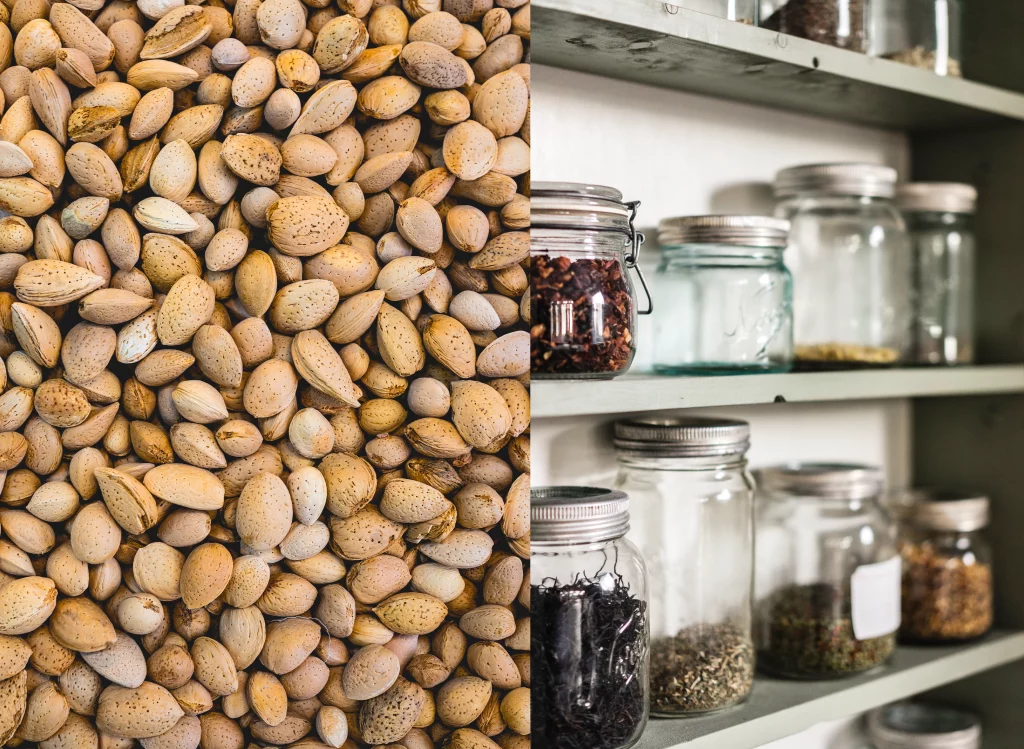
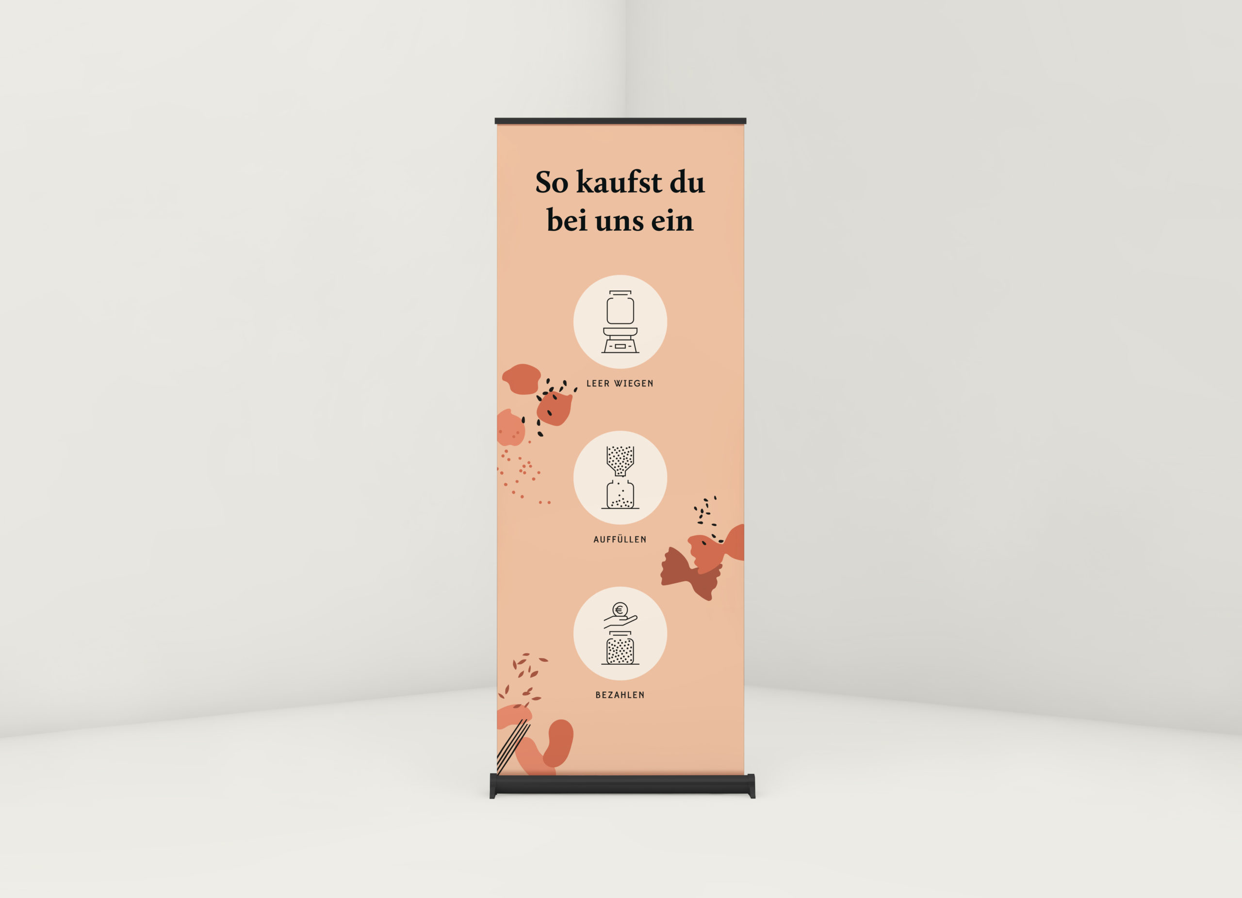
Ganz Ohne offers packaging-free shopping in Herrenberg. The goods – e.g. seeds, pasta, cereals – are sold loose. The objective is to avoid plastic as much as possible. Instead, customers take their own containers with them to fill up their purchases.
Briefing
The aim was to create a matching corporate design for Ganz Ohne. Natural, rustic and minimalist were the key words for this.
Realisation
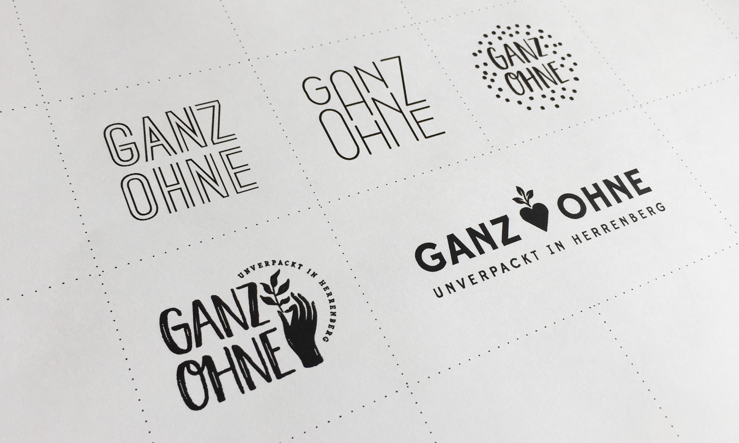
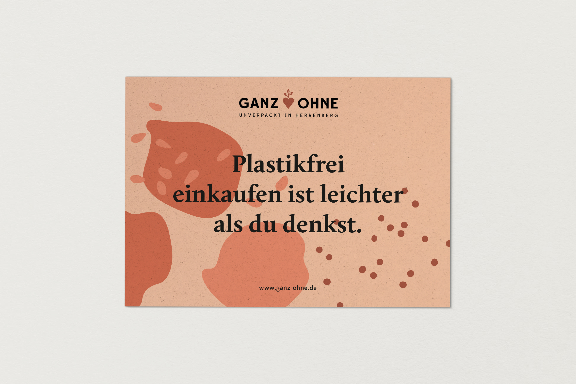
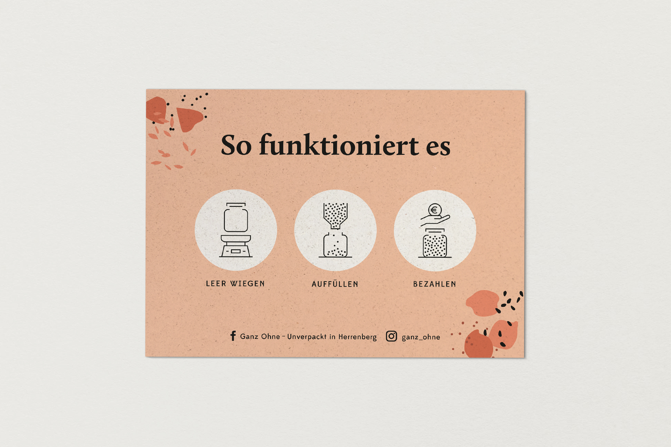
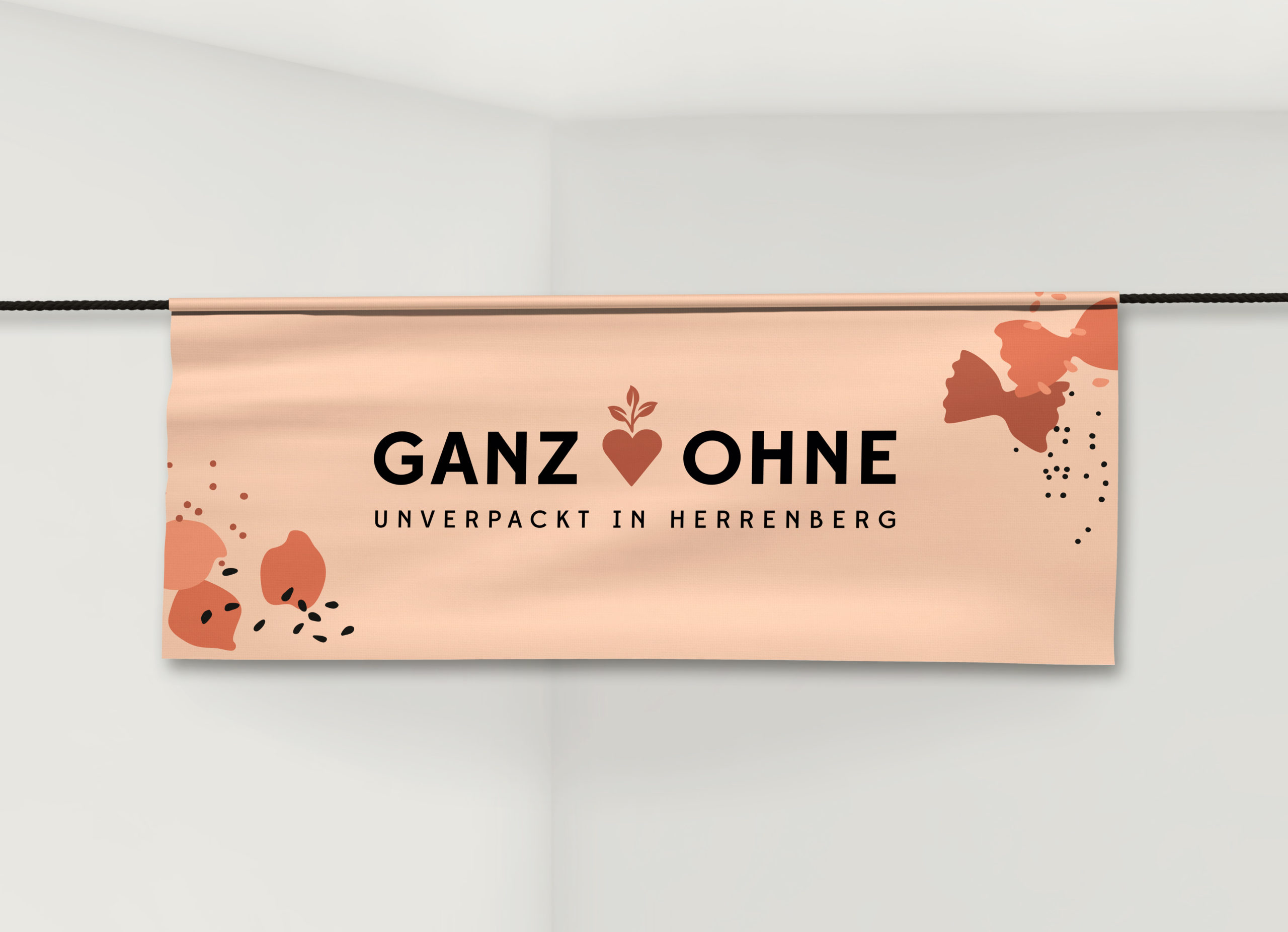
The vast majority of the competitors used a preserving jar as their logo symbol. However, we wanted to distance ourselves from this, because ultimately the packaging should not be the focus. I developed different logo variants – purely typographic, focussing on loose goods and with a focus on nature. From the sketch of a seedling, a heart emerged from which three leaves grow. It is symbolic, distinctive and reminiscent of a turnip. The founders liked the idea of using the signet to create a personal, emotional and natural connection. For the corporate design, I chose warm, intense colours and friendly typefaces. I also illustrated loose seeds and minimalist icons that visualise the process of purchasing. Flyers and business cards were printed on grass paper.