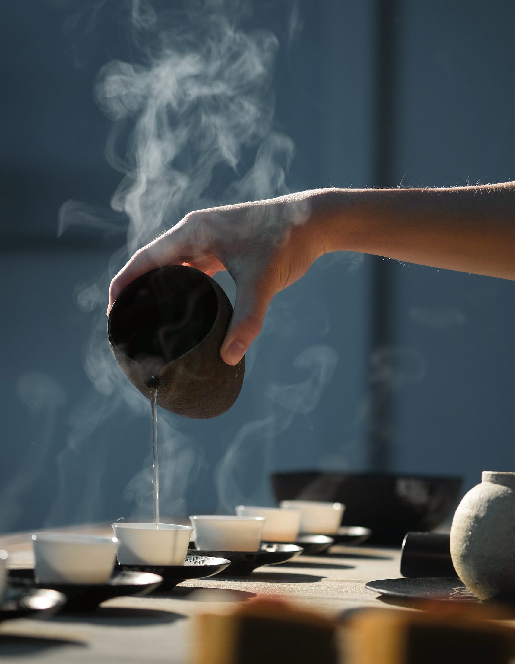
About mori
The label mori stands for quality, craftsmanship and timelessness. mori collaborates with selected manufacturers who share this claim and brings their products to the market. The Japanese Wabi-Sabi philosophy, the connection between man and nature and the idea of mindfulness play a central role at mori.
Briefing
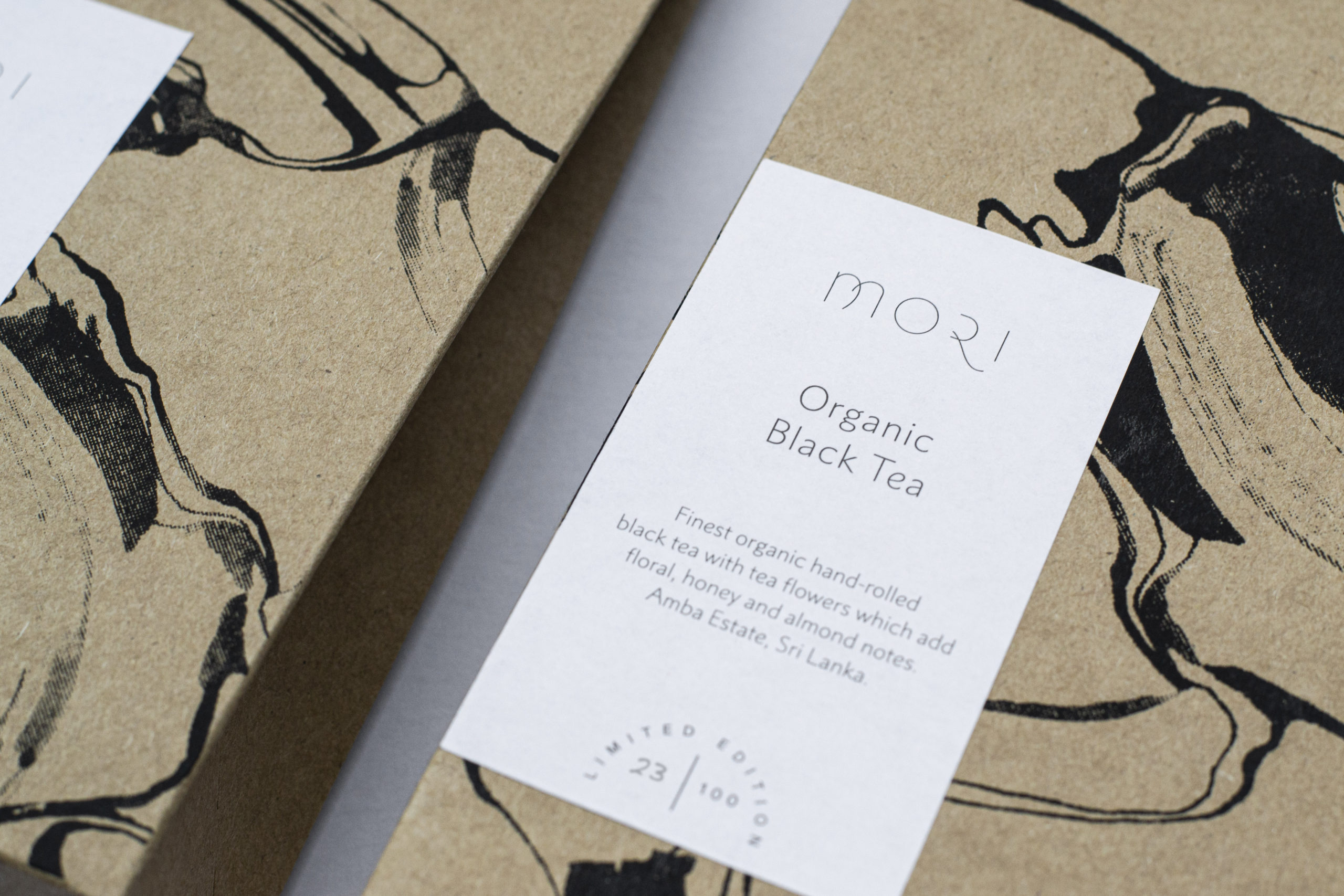
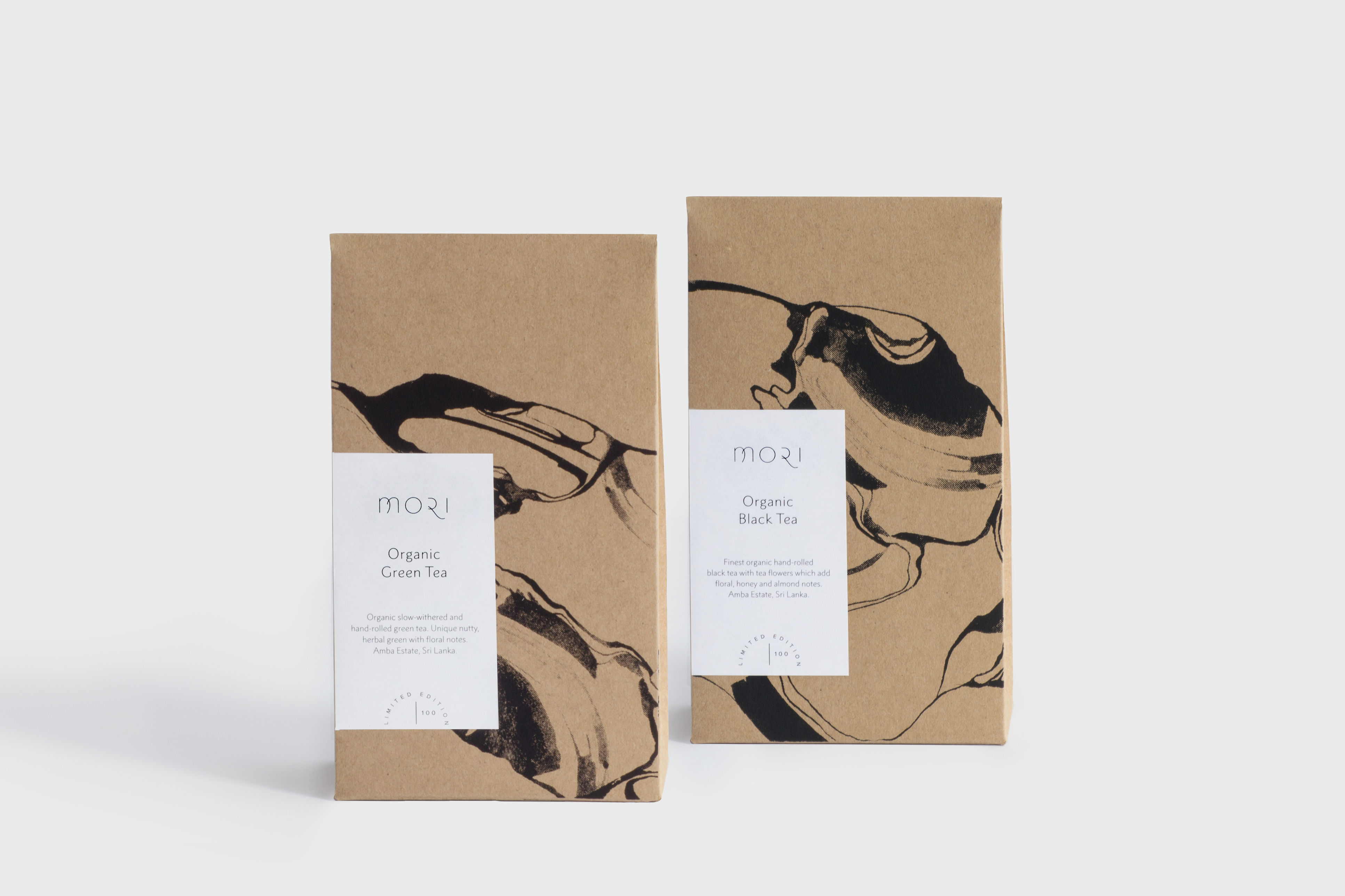
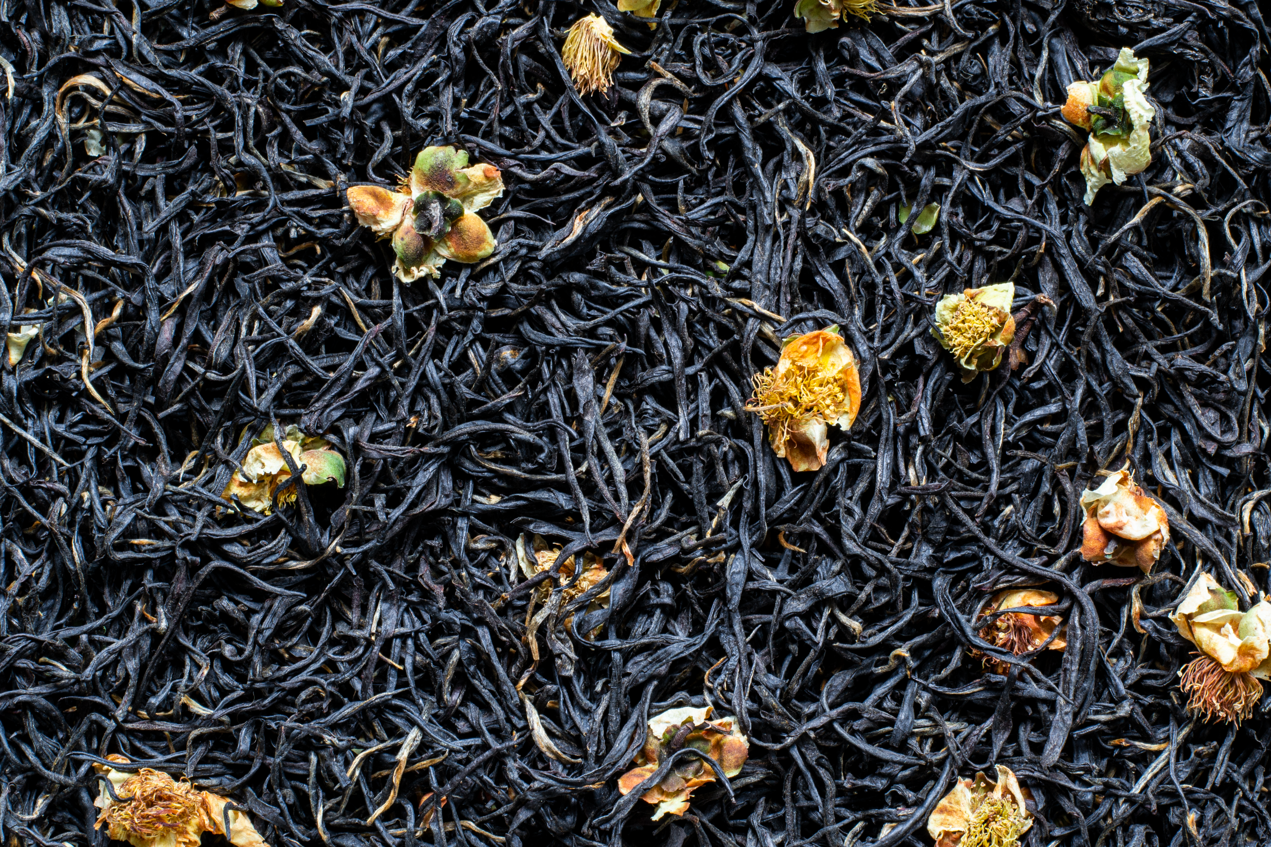
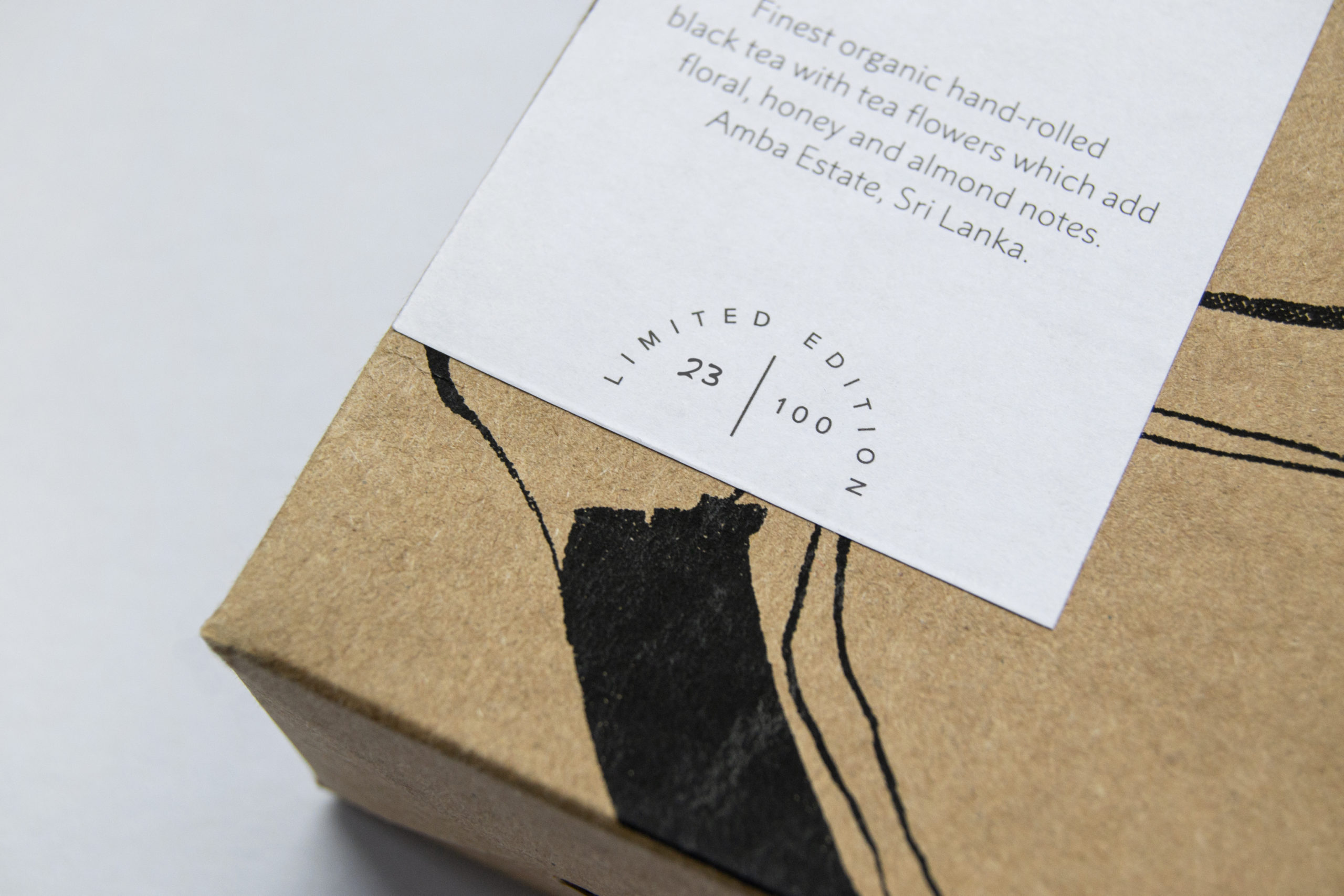
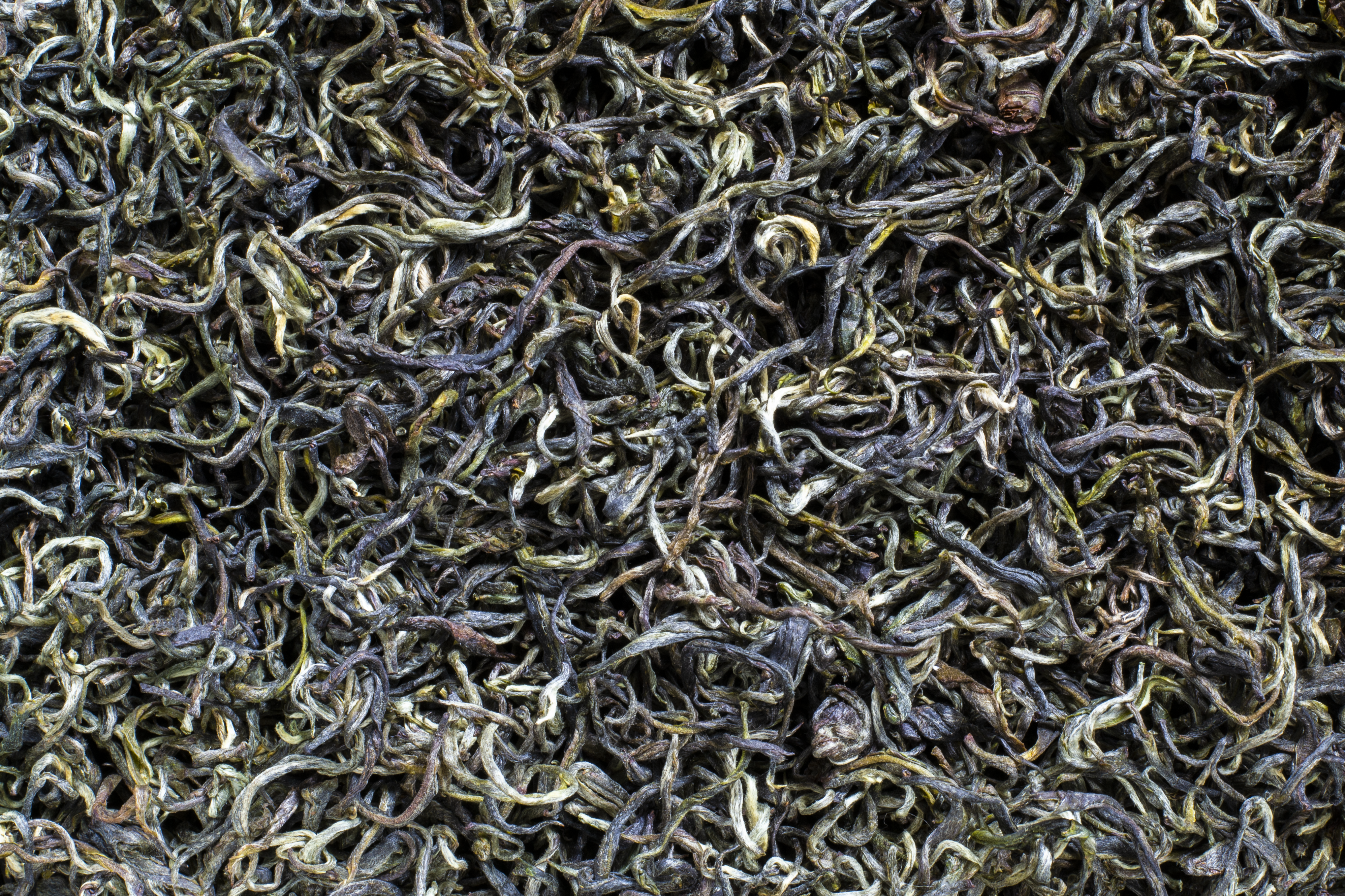
mori wanted a packaging design for the two hand-picked organic tea varieties “Organic Green Tea” and “Organic Black Tea”, which are grown by the Amba Estate manufactory in Sri Lanka. The premium product was to be available as a limited edition of 100 units of each variety and should not have a typical premium look, but primarily reflect Mori’s values. The logo, fonts and packaging were specified by mori, as was the content to be placed on a label.
Concept
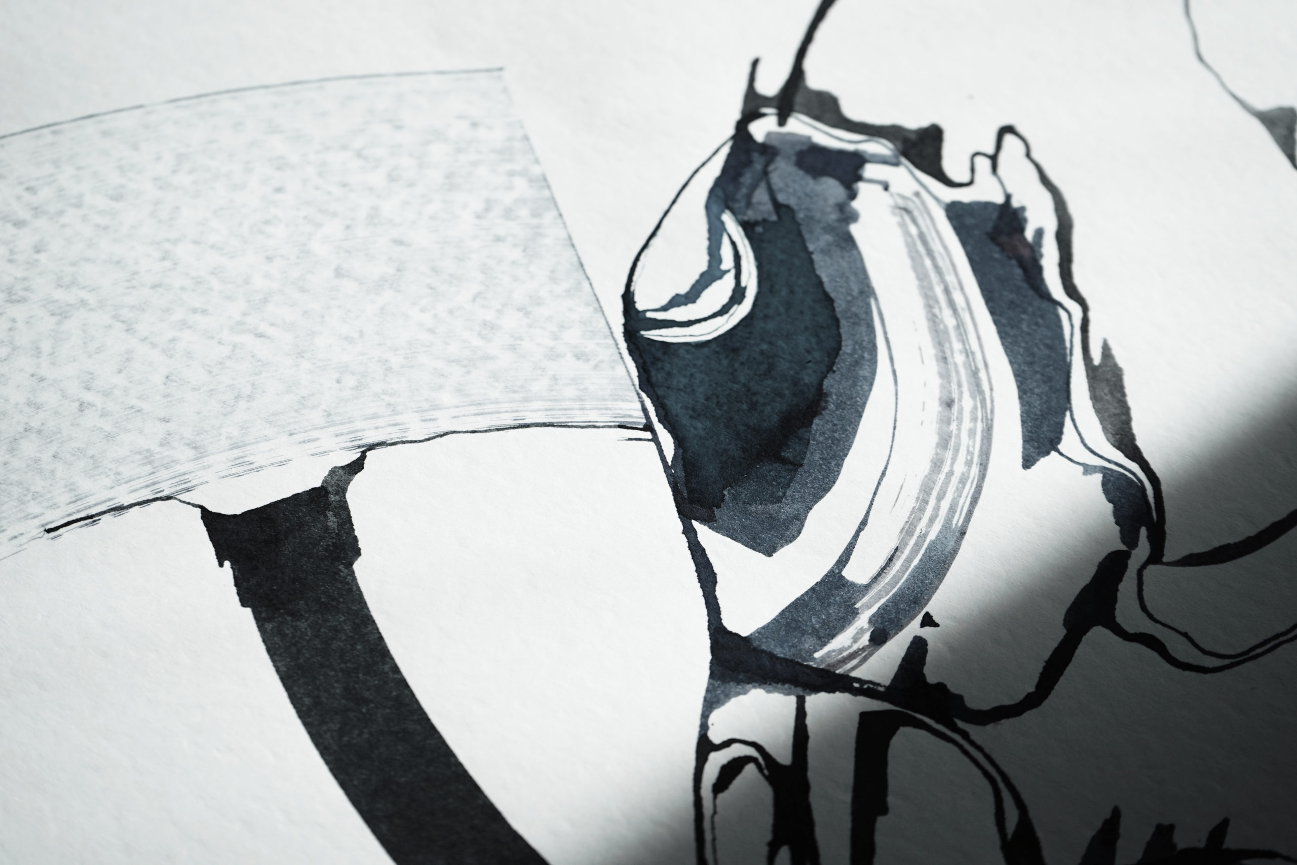
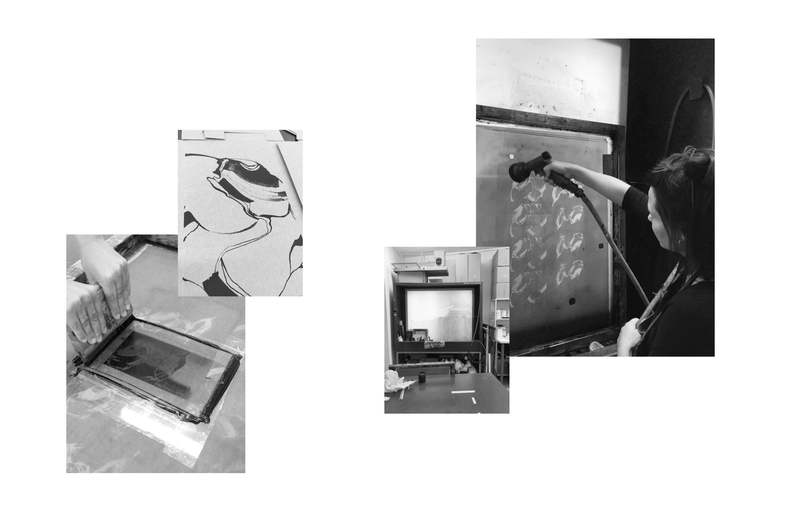
The basic idea for the packaging design was an abstract depiction of tea plantations, mountains and flowing shapes. As a contrast to the flowing calligraphy, the label was given a minimalist layout. A limited edition field, in which the quantity could be written down by hand, gives the product even more value.
Implementation
I tested calligraphic drawings with ink and various writing tools on paper and then modified them digitally. A limited edition of 100 pieces of each type was realised by hand using screen printing.0 pieces per type was printed by hand using screen printing.
The packaging design was listed among The Best Tea Packaging Designs by DesignRush.

“I work with Alessandra through my own brand mori and for my clients on the topic of brand and web design. Her work is always professional, reliable, with an eye for detail and constant, creative ideas. At the same time, I appreciate her kind honesty, because it’s the result that counts and I’m always more than happy with it.”
Jennifer Munz
Founder of mori