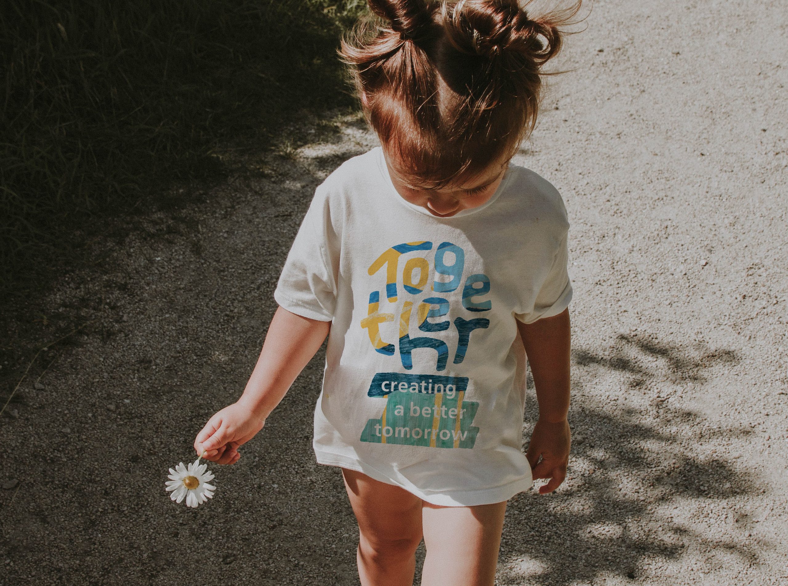
The writing tools manufacturer Stabilo wants to become a climate-neutral company by 2025. For the look and feel of their sustainability initiative “Together”, I developed a key visual, a colour scheme and icons commissioned by the design agency factor product.
Alessandra Fasino – key visual, colour palette, icons
factor product – communication concept
Liubov Ilchuk – header photo
Find more info on the Stabilo Together website
Key Visual
The key visual is a typographic interpretation of the campaign name “Together”. The letters form a circle close to each other. Underneath is the claim, as if it was written with a Stabilo highlighter.
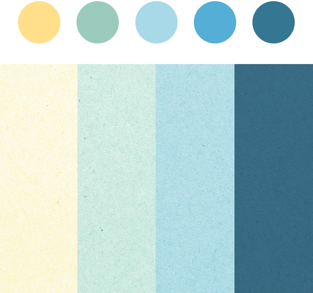
Colours and backgrounds
A natural feeling is created by a pastel colour palette in a yellow-turquoise-blue range and backgrounds in coloured uncoated paper.

Icons (partially implemented)
The icons represent the areas where a change is to happen. They are a combination of digital lines and analogue scanned colour fields realized with two Stabilo highlighters.
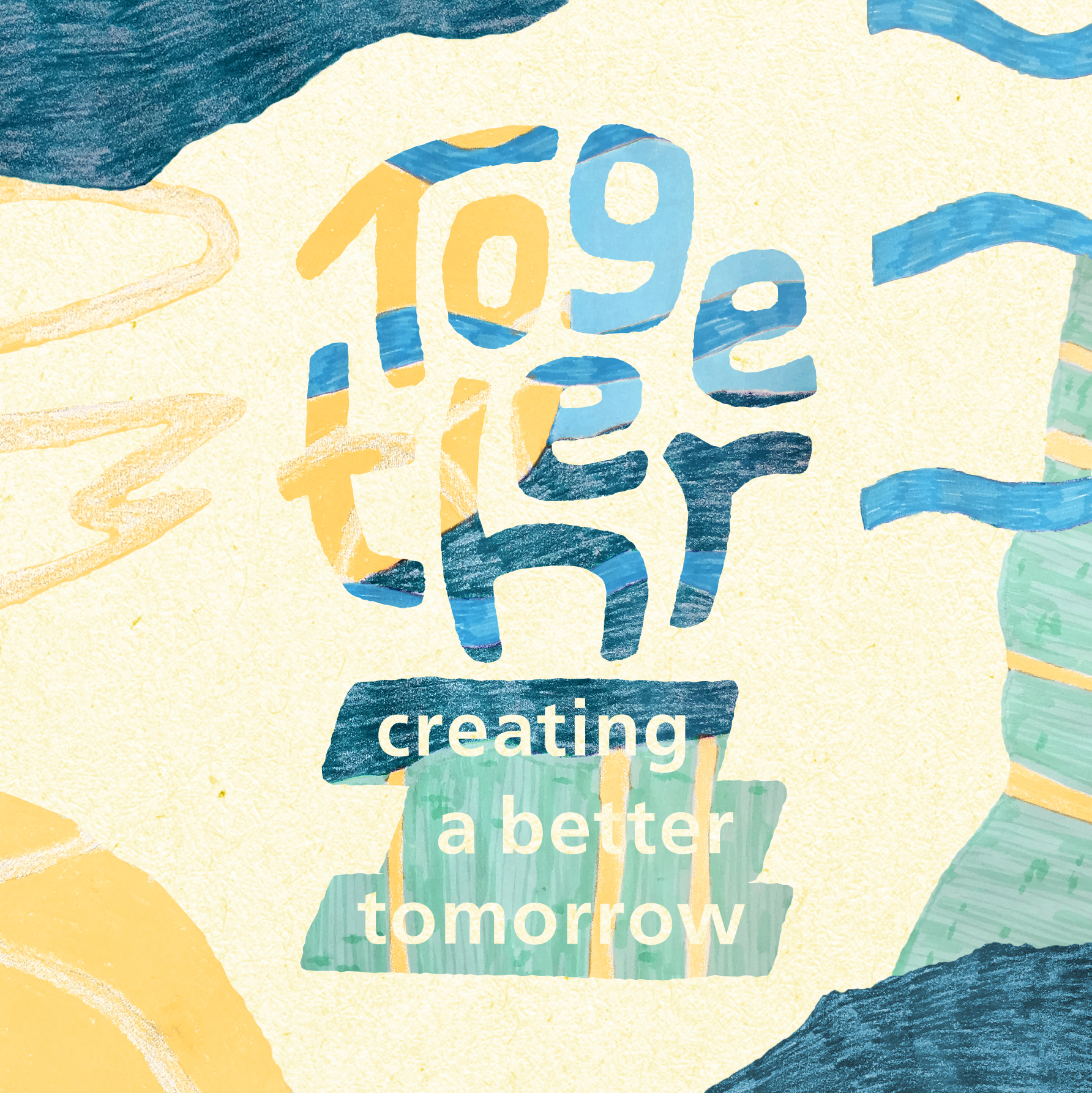
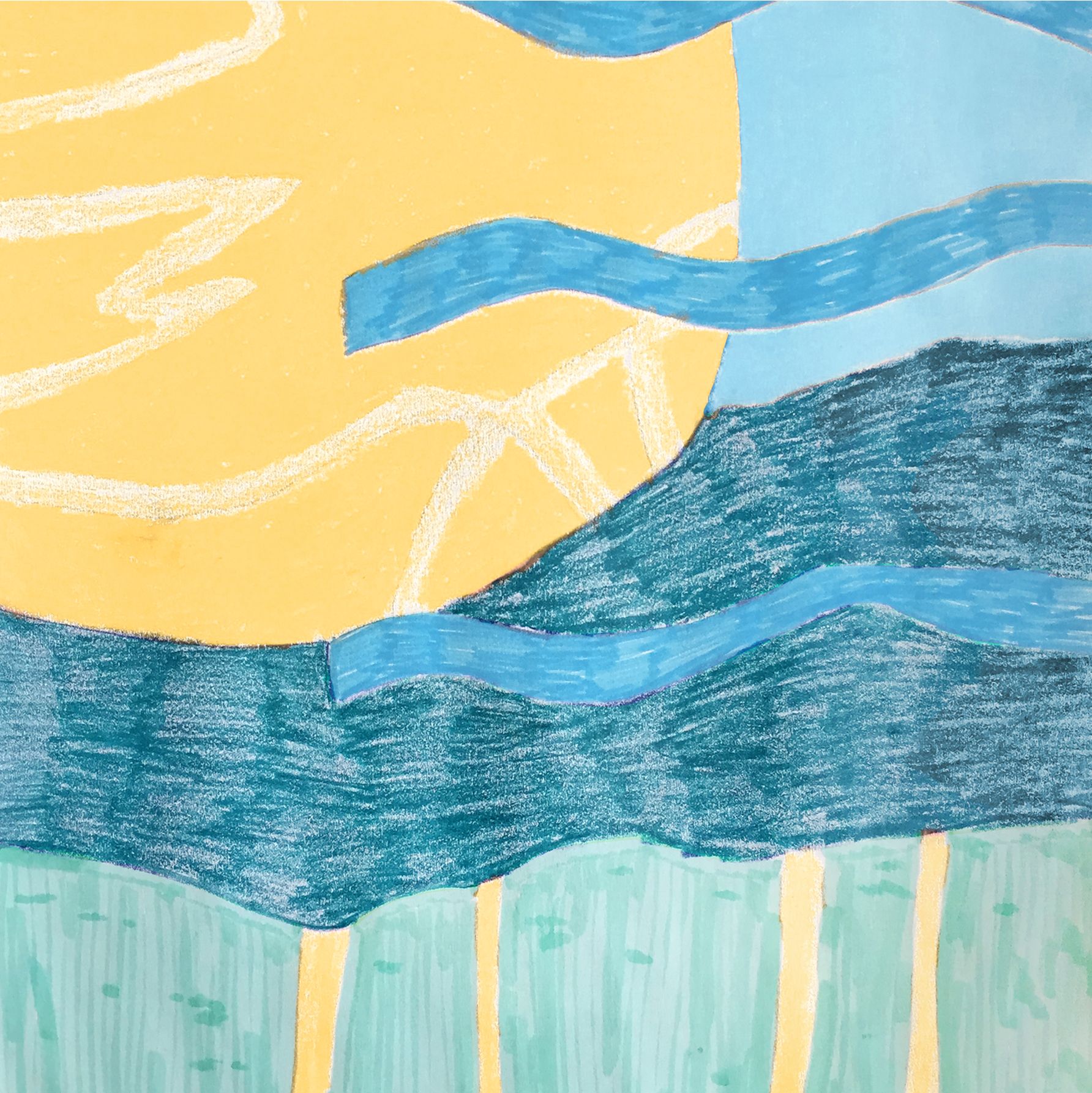
Illustration (not realized)
Using Stabilo pens, I designed an abstract composition of sun, water and meadow, which was intended to increase the recognition value, e.g. as a background for the logo or also in the implementation of other print and online media.